/
/
0 min read
Ecommerce SEO: 10 mistakes that make your visibility tank

Products aren’t sorted into categories. Often, all products are simply displayed on the same page. Sometimes, a store has umbrella categories (Shoes, Clothes) instead of subcategories that your target audience is looking for (Air Force 1, Maternity Dresses).
The site has far too many deep subcategories. Usually, you should be able to find any product after approximately three clicks from the front page. If the online store is very big, however, your subcategories can go a little deeper.
All categories link to all other categories and subcategories. This does not make sense to Google (as it makes it confusing for the search engine to understand the purpose of your website) or to users (as you’re presenting them with far too many options).
Think about what kinds of products you offer and sort them into categories.
Sort these categories into subcategories based on specific products.
Sort your products under the right categories — try to only include products in one or two categories.
Get your CMS started with implementing your changes.
How do the clothes fit?
What is your return policy?
What brand is the product by?
How do I get the most value for my money?
How do I care for the product after purchasing it?
Make sure that your URLs always follow the same order, e.g. by listing filters in the same order so they always start with color, then material, then size, etc.
Next, you should canonicalize the URL to the original version of the page without filters. This tells Google that this is the original URL, and that the others are only variants. It should look like this:
You can also choose to block Google from crawling your filters by working with your robots.txt.
Bestsellers and most popular: Show your customers the products that other customers often purchase.
Profit: Show your customers the products that make you the greatest profit.
SEO priority: Show your customers and Google the products you want to rank.
Canonicalize the color variants to a common URL — so /blue and /red are both canonicalized to /t-shirt. The same solution goes for your filters.
Many CMS solutions allow you to choose colors on the same page, and the difference is only visible to you once the customer has actually ordered the product. In this case you don’t have to do anything.
In some cases the color might be quite important because certain colors have a high search volume. In many of these instances you should actually have separate URLs for different color variants.
When it comes to ecommerce SEO, there are many mistakes you want to avoid. Technical errors are commonplace in SEO — but so are strategic errors conflicting with your business goals.
Online stores often have thousands (if not tens of thousands) more pages than e.g. service companies. This makes ecommerce SEO a very technical discipline. Therefore, this post isn’t going to deal with basic SEO mistakes.
We’re not going to talk about how to get target keywords into your headings. Instead, we’re going to go over some of the great technical errors that we as an SEO agency often see when new clients come to us for aid.
In this post, you’ll learn about 10 of the most common and critical ecommerce SEO mistakes — and how to fix them.
What is ecommerce SEO?
Ecommerce SEO is search engine optimization for online stores. Examples of search engine optimization for online stores include writing product descriptions with target keywords and obtaining backlinks from relevant websites.
Following best practices for website structure, content, and link building are all important aspects of search engine optimization for ecommerce that can improve your online store’s ranking position.
In short, ecommerce SEO helps your online store show up on the first page of Google. However, the more search engine optimization mistakes you make, the more difficult this is to achieve. Read on to learn how to avoid making the 10 great SEO mistakes that make the visibility of your online store tank.
Mistake #1: Your pages aren’t keyword optimized
#1 The problem
When your future customers open Google, they type words or phrases into the search bar. Google then tries to find content that matches their search intent — and you want that content to be yours. One of the ways Google finds content is through the use of keywords in headers (H1, H2, H3, etc.) and product descriptions. Keywords in image titles, page titles, and alt texts are also taken into account.
However, many online stores write about their products like they’d talk about them internally. This often means that product descriptions are full of industry jargon that users aren’t searching for. Here, it’s important to note that it doesn't actually matter whether your customers call your product by the right name — what matters is that they choose your product over your competitors’.
In addition to not using the right keywords, many stores also write about their products the wrong way. Search intent is the alpha and omega of all SEO — including SEO for ecommerce. This means that you have to deliver product descriptions in exactly the format that your target audience is searching for. Here, we often see landing pages or product pages optimized for keywords that would do much better on a category page or a blog. Google is a semantic search engine; this means that when optimizing pages, you should think about your users’ needs and the information they’re searching for.
In short: If you don’t optimize your pages for the right keywords and the right format, no one will ever find you on Google.
#1 The solution
Any problem with search intent and keywords can be solved with a thorough keyword analysis. This will give you a precise overview of which keywords belong on which pages so you can optimize your website accordingly. Once the analysis is done, all that’s left to do is roll up your sleeves and get to work.
Mistake #2: Your structure is too deep
#2 The problem
A successful website is simple, well-structured, and easy to navigate. This is good for ecommerce SEO because it makes it easier for Google to understand the content of your website — especially if your online store contains a lot of products.
Therefore, you should think about the layout of your website and try to make it as user-friendly as possible. There are many different design options available for online stores. In the image below you can see a classic structure example that always works:

Here are a few examples of structural problems we often encounter:
A structure that’s too deep can be a problem: you’re indirectly telling Google that the pages at the bottom of the category hierarchy have no value. Simultaneously, users will leave your store if they can’t find the product they’re looking for.
A deep structure also means that any authority gained from inbound links will be unevenly distributed — and this isn’t great if you’re dreaming of high rankings.
Listing products in the wrong subcategories is also a problem. Your products won’t match the category keywords, and the mismatch between subcategories and products will confuse and frustrate your users.
#2 The solution
This problem often arises when the website is being built. When this mistake has already been made, it can take quite a while to clean up your categories. You should therefore map out your categories well so they match the right keywords and search intents from the beginning.
How to do this depends on the ecommerce system you’re using — Shopify, for example, does not have the same layout as WooCommerce. But here are four quick steps to ensure that you avoid a very time consuming process later:
Mistake #3: You’re not creating the right category pages
#3 The problem
I touched on this above: When it comes to ecommerce SEO, it’s important to create category pages for what users are actually searching for. This means that if your categories are too broad, you won’t show people that you have what they’re looking for. But if your categories are too narrow, it’s going to be hard to get search volume for your keywords. Remember: if the search intent is to find a category page, it’s because users want more product options to choose from.
You can ensure that you create the right category pages based on your keywords and how they’re integrated in the taxonomy of the pages. But it can also be done through in-depth knowledge of your product catalog and the questions your users have.
Those questions are important — and the information on your category pages needs to provide answers for them. It’s much easier to give your customers the right information and guidance if you have three separate categories for “dog food,” “vegan dog food,” and “dog food for sensitive stomachs” than it would be if all types of dog food were listed under one big category.
#3 The solution
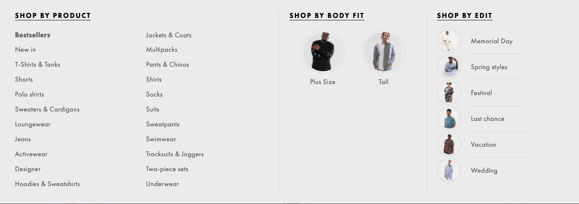
To avoid this issue, you need to go back to your keyword analysis and the taxonomy of your pages. Another option is to take a look at your competitors — how do they sort their products into categories, and does it work well? Take, for instance, one of the world’s biggest online stores: Asos. Here’s how they list product categories:

Here, you can see that their products are sorted into both umbrella categories (Swimwear, Pants & Chinos, Jackets & Coats), but also sorted by occasion (Festival, Vacation, Wedding).
If you look a little deeper, you’ll notice that Asos also sort their categories into further subcategories that users are searching for:

Here, you’ll see both skinny jeans, tapered jeans, ripped jeans, and much more.
Mistake #4: You have no product descriptions
#4 The problem
The heading speaks for itself. Many online stores simply don’t have product descriptions on their category and product pages. You might think that the product speaks for itself, but you need to remember that users shopping online don’t have the option to ask questions about products like they would in a brick and mortar store.
The more questions you can answer about the product, the greater your chance of conversions.
Simultaneously, Google often requires text that tells the search engine what your pages are about and how good you are at guiding your customers. This has a significant impact on your rankings and indexing, and it also has a tangible effect on your conversions.
Another ecommerce SEO mistake I often come across is text written in a less than ideal format. Google is pretty good at reading blocks of text, but much better at reading structured text like bullet lists, numbered lists, tables, and many other structured formats. You should also use structured data, which I’ll come back to later.
#4 The solution
Start by reading our guide to SEO content. Once you’ve done this, all that’s left to do is get started.
This might sound tedious — especially if writing doesn’t come naturally to you. If that’s the case, it might be an idea to hire a content writer or an assistant, or to enlist an SEO agency for help.
Besides the keyword analysis you should do prior to writing, you should think about which questions customers would ask about your product before purchasing it.
Examples:
Mistake #5: You’re approaching filters wrong
#5 The problem
Brace yourself: things are about to get technical. If your company doesn’t have a web developer who understands technical ecommerce SEO, this might be the time to enlist an expert.
The vast majority of modern online stores offer a filter option. This allows users to filter products by different attributes such as size, color, and more.
Here’s an example:
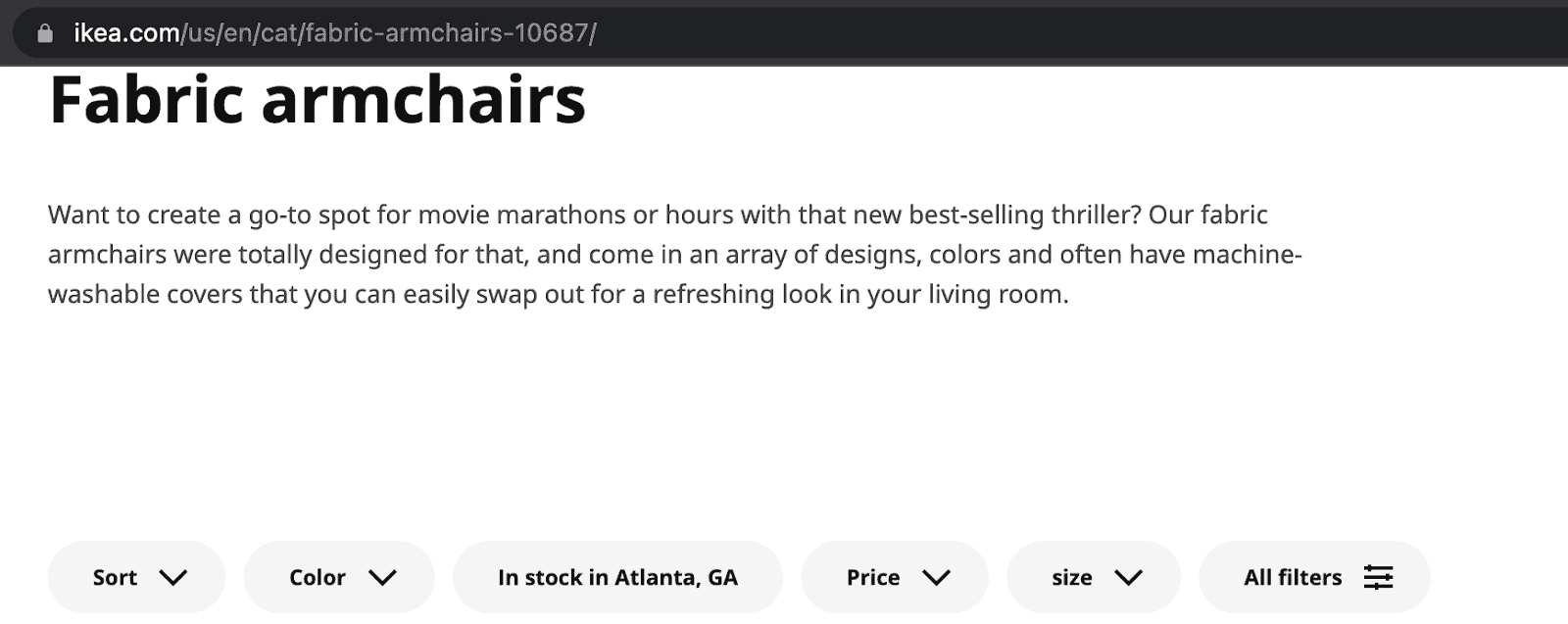
If you go to the category page for fabric armchairs on IKEA.com (the one in the address bar), the URL looks like this:

If you add a filter for e.g. color, the URL changes to this:

Note how the URL changes to include “?filters”, showing that we’re now filtering to view only gray fabric armchairs. If we add another filter for material, the URL changes again:

So far, so good. These URLs are all unique and must be individually indexed and should rank for different keywords. What many people don’t realize, however, is that these filters depend on the order in which they’re added.
This means that if you’d started filtering by material and then color, the URL would be something else entirely. And this is where the problem arises: You now have three URLs with the same content — and that makes it harder for Google to understand which page should rank.
This is also where Google’s and users’ requirements begin to differ —none of this matters to the end user, but it matters to Google.
Now, as you can see, IKEA approaches filters correctly, but not everyone does. And messing up filters can be critical: it means that you might end up with hundreds of variant URLs with almost identical content — i.e. duplicate content. And even though there’s no direct penalty for duplicate content, there is an indirect penalty in how hard it is to control which page gets indexed and ends up ranking.
#5 The solution
Depending on which online store system you use, there are several ways to solve this problem:

Mistake #6: Missing or incorrect structured data
#6 The problem
In 2022, structured data is one of the most important elements in good SEO. Structured data is a special form of code that instructs Google in how to understand your page. This is particularly important to online stores because there is a particular form of structured data which is drawn into the search results and can lead to more clicks. It looks like this:

The structured data on your online store is what makes e.g. product reviews show up. In the example above, it’s also responsible for other neat elements such as “Dial color”, “Movement”, and so on. It often also shows the price of the product. (Google also emphasizes that you can actually achieve similar results through your meta descriptions.)
If you view Google’s search results as a window display, this is where you can beat your competitors. You can learn more about structured data directly from Google here.
#6 The solution
Once again, this is another technical matter. But many CMS platforms do this for you automatically if you install the right plugin or tick the right box.
What you should do is get to know the different kinds of structured data that you can use on your website and then make sure to add it. Don’t worry — you don’t have to be a code wiz to do this. There are many tools available that can do it for you.
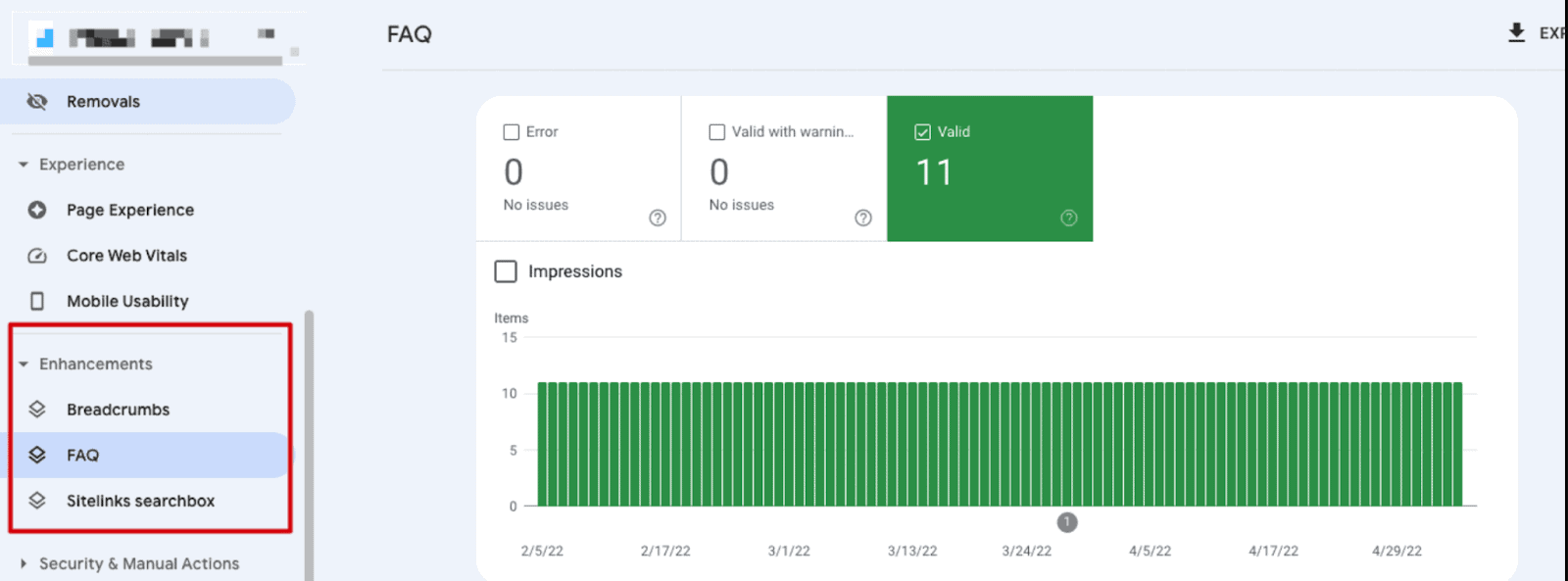
However, if I were you I’d take the opportunity to open Google Search Console and check your structured data report to see if it shows any critical errors. You can see this in the panel on the left hand side:

Mistake #7: You’re canonicalizing your paginated pages wrong
#7 The problem
We’re now returning to canonicals. Something I often see — especially if our clients have previously collaborated with other SEO agencies — is the critical mistake of canonicalizing your paginated pages for page 1.
Yes, that sentence is a mouthful. Let’s explore this a little further.
Canonicalization is a signal you send to Google showing which page you think should be ranking.
Pagination is the extra pages you see in online stores where you can flip between pages 1, 2, 3, and so on.
A bad piece of advice that some people follow is that if you canonicalize everything after page 2 to the first page, you can consolidate your ranking signals. In some instances, this can —potentially — be true. But in almost all cases it means that you keep Google from indexing any content beyond page 1. This means that those unlucky products not displayed on page 1 are very, very unlikely to rank.
#7 The solution
The solution to this issue is very simple: don’t. Instead, all paginated pages should be canonicalized to themselves (known as “self-referential canonical”). In most cases this happens automatically, but otherwise you need to find the section of your ecommerce system that handles pagination and fix your pagination settings.
In some older systems, this requires manual coding.
Mistake #8: You leave your sorting to chance
#8 The problem
This problem is about depth, and it therefore relates to mistake #2. A good rule of thumb is that the deeper a page is, the farther away it is from the front page — and the less important it will seem to Google.
Let’s return to sorting. Most online stores have different ways to sort pages. You can sort alphabetically, by price (low to high or high to low), or by other criteria. The problem is that if you leave your ecommerce system to sort pages on its own, you leave it to chance how deep your various products will end up. And this is a pretty strong ranking signal.
The more products you add to your store, the greater this problem will be. If you let your default sorting be alphabetical, this is the order in which Google will see your products. After all, Google doesn’t select filters when crawling your website.
This means that you’ll continuously be sending very different signals to Google — and the exact content on a category page might end up determining how well that page ranks and whether it ranks at all.
#8 The solution
There is no one size fits all-solution to default sorting. The most important thing is to choose your default sorting based on what best supports your goals. For example, you can sort by:
Mistake #9: Your images are loading wrong
#9 The problem
Images are an important part of having an online store. After all, a category page without pictures would be nothing but a list of links. Most people want something to catch users’ attention, and the quality of your images can have a tangible effect on your conversion rate.
But images are also one of the largest file types. This can cause a few different issues:
1. You’re loading large image files in the wrong format
Most online store owners want to display their products in all their glory. This means that they’ll often upload images in the same format in which they took them or received them from the supplier.
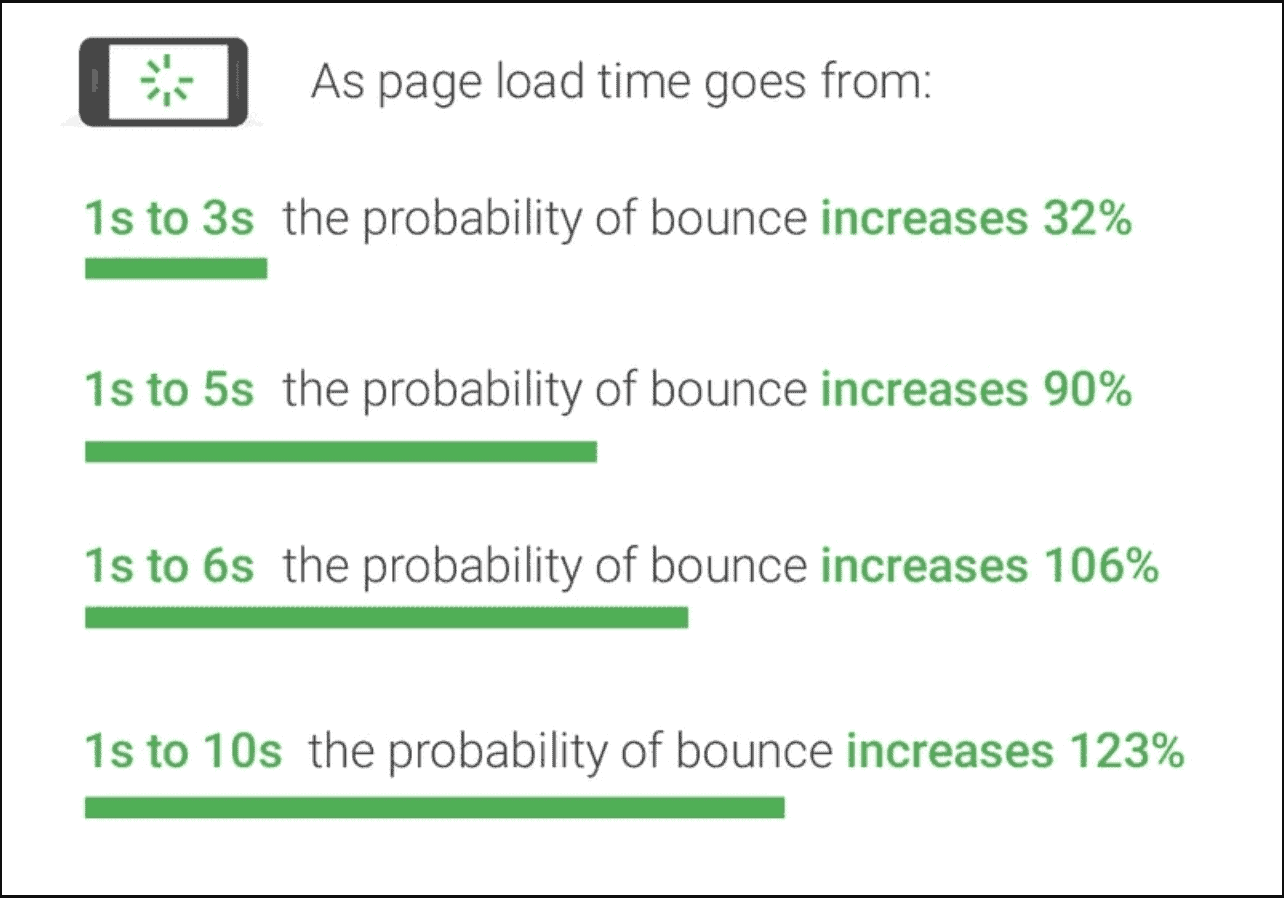
The problem is that large image files in very high resolution take a very long time to load. And the longer it takes to load a page, the more likely it is that your visitors will leave again:

Another element is the use of wrong file formats. Because it matters whether the file you’re loading is a PNG, JPEG, or WebP file.
#9 The solution: Images should be compressed and uploaded in the right size and format. You can read more about file formats in our guide to image SEO.
2. You’re not inserting images in a fixed size
Even though an image looks smaller, it doesn’t mean the file is smaller, too. Therefore, you should always make sure that images on your website are inserted in a fixed size — and that size should follow the size the image is uploaded in.
This problem relates to Core Web Vitals — specifically to the metric called Cumulative Layout Shift.
If the frame (or container) the image is loaded in doesn’t have a fixed size, your browser first has to figure out the size of the image before it can be loaded. This can make elements jump around on your pages, which causes a very poor user experience.
The solution: Images should be coded to load in the right size. This example from Ditur shows how to set a fixed “width” and “height”:

It’s also recommended that the images in the -tag should have dimensions matching the dimensions of the box — meaning the width and height used on the page should be the same as those of the image.
Mistake #10: You haven’t considered product variants
#10 The problem
Let’s say that you own an online store selling clothes. You have a basic t-shirt available in a number of different colors — green, red, blue, and so on. These are product variants. Other such examples are different sizes and materials.
So how do you create these variants in your online store?
Some choose to create separate URLs for each color, which then link to each other. Such URLs could look like this:
onlinestore.com /t-shirt-red
onlinestore.com/t-shirt-blue
This can also be done by filters:
onlinestore.com/t-shirt?color=red
onlinestore.com/t-shirt?color=blue
So why is this an issue? Well, it isn’t necessarily. But it needs to be done strategically, and it needs to be structured well. Because if there aren’t many users searching for e.g. a t-shirt in specifically red and blue, then you have two pages that really aren’t that different from one another. The textual content on the two will be very similar, the brands are the same — the only difference might be a single word in a title or heading.
This makes it hard for Google to know which page should rank. And that might mean that you’ll never make it to the top of Google.
#10 The solution
Based on different scenarios, there are several ways you could handle product variants. Many of them depend on the technical set-up of your website — i.e. what CMS solution you’re using.
The most typical solutions to this issue are:
Find your mistakes with our ecommerce SEO checklist
Now that you’ve read about these ten critical SEO mistakes, you’re probably beginning to realize that good ecommerce SEO isn’t the easiest thing to do. It takes a lot of technical finesse to ensure that Google will load and understand your online store correctly. And loading it is the first step towards the most coveted positions in Google’s search results.
Go through the ten points above and use this post as a checklist for your ecommerce SEO. This will help you determine if you need help with your SEO — and, if yes, what you specifically need help with.

CPO & Partner
Thomas is the CPO (Chief Product Officer) and Partner at Bonzer, which means his day-to-day focus lies in constantly analyzing Google's algorithm and developing SEO as a product. Thomas has worked with SEO for several years with a strong passion for sharing his knowledge on how businesses can best implement SEO into their operations. In addition to Bonzer, Thomas contributes his expertise to readers at publications like Search Engine Journal, DanDomain, and Detailfolk. He also teaches Digital Media Strategy at Copenhagen Business School and SEO at DMJX in Copenhagen. If you have any questions or requests regarding the SEO universe, feel free to contact him at [email protected].

Let us show you an SEO strategy that can take you to the next level
A brief meeting, where we review your position in the market and present the opportunities.
Let us show you an SEO strategy that can take you to the next level
A brief meeting, where we review your position in the market and present the opportunities.