/
SEO
/
0 min read
How to Optimize Your Website for Mobile SEO
Mobile devices have revolutionized the way people access information and interact with websites. With a significant increase in mobile users, businesses must ensure their websites are optimized for mobile SEO. While many SEO ground rules, such as technical health, helpful content and website trustworthiness and authority, apply to all devices, optimization for mobile and in particular SEO requires special attention due to Google's mobile-first indexing. In this guide, we'll walk you through the essentials of mobile SEO, from understanding what it is and why it is important to effective optimization strategies. So, read along and learn how you can SEO-optimize your website for mobile success.

What is SEO for Mobile?
Search Engine Optimization (SEO) for mobile is about improving your website's design, content, and overall performance for users using smartphones or tablets. Mobile SEO aims to provide users with a seamless and user-friendly experience on mobile devices. By implementing mobile SEO strategies websites rank in top positions in search results pages which potentially results in more traffic, conversion and ultimately revenues.
Why is Mobile SEO important?
Mobile SEO holds significant importance due to the shift in user behaviour towards mobile devices. Consider this striking fact found by Google research: while 64% of retail browsing occurs on mobile devices, conversion rates are 50% lower than on desktops.
One of the reasons why you should prioritise mobile SEO includes the rising use of mobile devices for search and Google's implementation of mobile-first indexing, where the mobile version of your site is primarily used for indexing and ranking.
How to optimize SEO for Mobile?
1. Focus on optimizing Page Speed
Faster page loading times lead to improved user experiences and better rankings. Google's studies have shown that optimizing your website’s page speed, especially for mobile, can have significant impacts on bounce rate, revenue, and conversions.
A great start is to use free tools that are available online, to evaluate whether your page needs mobile optimizations.
Consider for example PageSpeed Insights, a tool that reports on the user experience of a page on both mobile and desktop devices, and provides suggestions on how that page may be improved.
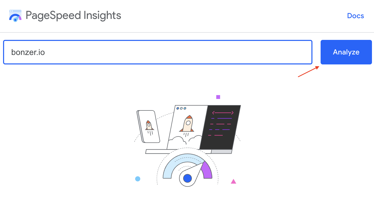
Once you have entered your domain, you get insights including concrete steps for improvement.
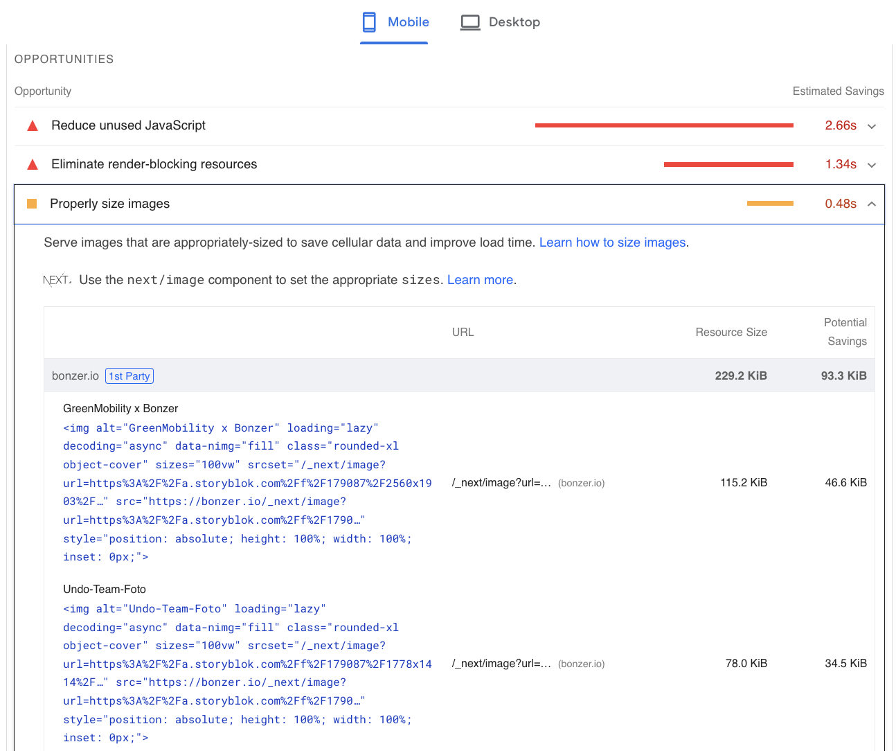
Some common issues that need to be updated for better page speed include image sizes and formats, minifying code, leveraging browser caching, and reducing unnecessary redirects.
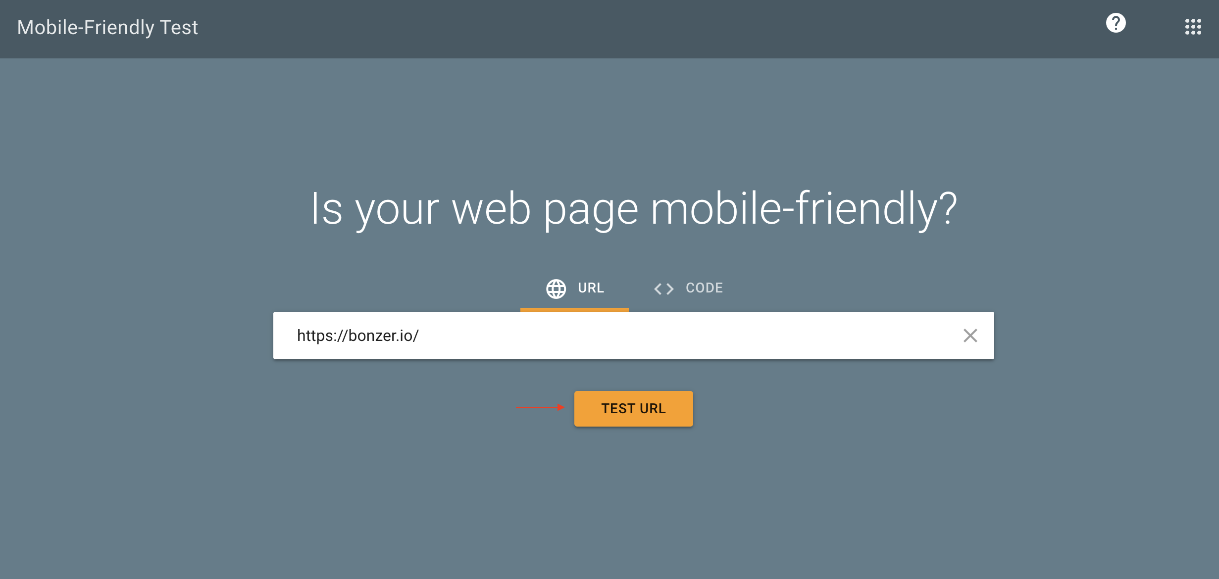
Another helpful tool which helps you evaluate whether your website is mobile-compatible is called Mobile-Friendly Test. Similar to PageSpeed Insights you start by entering the domain you want to test.
You can then see your test results. If your website is mobile-friendly the result will look the following way:
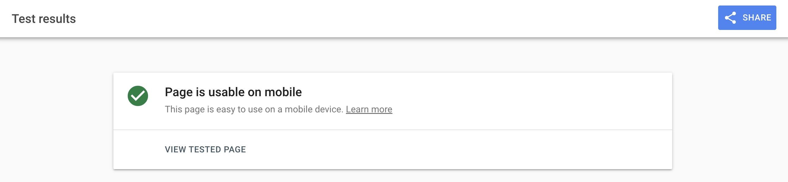
Under view tested page you can get more information about the inspected page.
2. Create Mobile-Friendly Content
As Google outlines, they use mobile-first indexing when ranking your website. Having this in mind your mobile pages should be designed in a way that customers can easily find and purchase products. In other words, this means using short paragraphs, optimized title tags, and concise meta descriptions to enhance readability.
Title tags should not be longer than 70 characters, otherwise, they are automatically shortened by Google. Just as on the desktop version, title tags should include the primary keyword, transmit important information and be unique to each page.
Regarding meta descriptions, it is important to keep in mind that one should put the most important words at the start so users know what they get once they click on the link. Moreover, the page’s content should be summarized with unique descriptions and a call to action should be implemented to encourage a click.
It is recommended to keep the meta description under 120 characters to ensure they are completely visible on desktop and mobile.
Further, it is recommended to avoid intrusive pop-ups that cover the screen and disrupt the user experience. Google punishes the use of pop-ups which cover the whole screen and thus the content of a page.
If pop-ups are used after all, this should be in a purposeful context as allowing or declining cookies or confirming the age of a user.
3. Optimize for Local Search
As the name says, mobile devices are mobile and hence used on the go. This has implications for search behaviour. As mobile users carry their devices with them, searching for products or services is often local and on the go too. Mobile users are intending to make quick decisions making it essential for businesses to optimize their websites for local SEO, and so should you.
In other words, include your business's name, address, and phone number on each page and leverage local keywords. You can find more information on local SEO in our guide.
Optimizing your website for local searches can increase your click-through rate and lead to better engagement. Ultimately, users searching for local businesses are often ready to make purchases and the likelihood of converting and driving revenue for your business increases.
4. Responsive Design

Having a Responsive design allows your website to adapt seamlessly to different screen sizes and orientations. This approach ensures that users receive a consistent and user-friendly experience regardless of the device they use. Online you can find various free tools that allow you to see whether your website is responsive or not.
Not only does a Responsive design allow you to have all content on single URLs, but it also saves you time from dealing with duplicate content or redirects which might slow down your page. After all, a responsive design is also recommended by Google and hence a huge win for your mobile SEO.
Check if your Website is Mobile Friendly
Once you have updated your website and ensured that it is optimized for mobile devices, it is crucial to check up on your implementations. Once again Google Tools might come in handy to get valuable insights.
As mentioned earlier, you can derive a significant understanding from PageSpeed Insights concerning loading time and speed. Any issues mentioned as part of the PageSpeed Insights report should be addressed as they might hinder optimal website performance.
In addition, Google Search Console can be used to monitor if there are any issues with your website. The tool helps identify mobile-specific issues and provides insights to improve user experience.
Once logged in, click on Mobile Usability on the left.
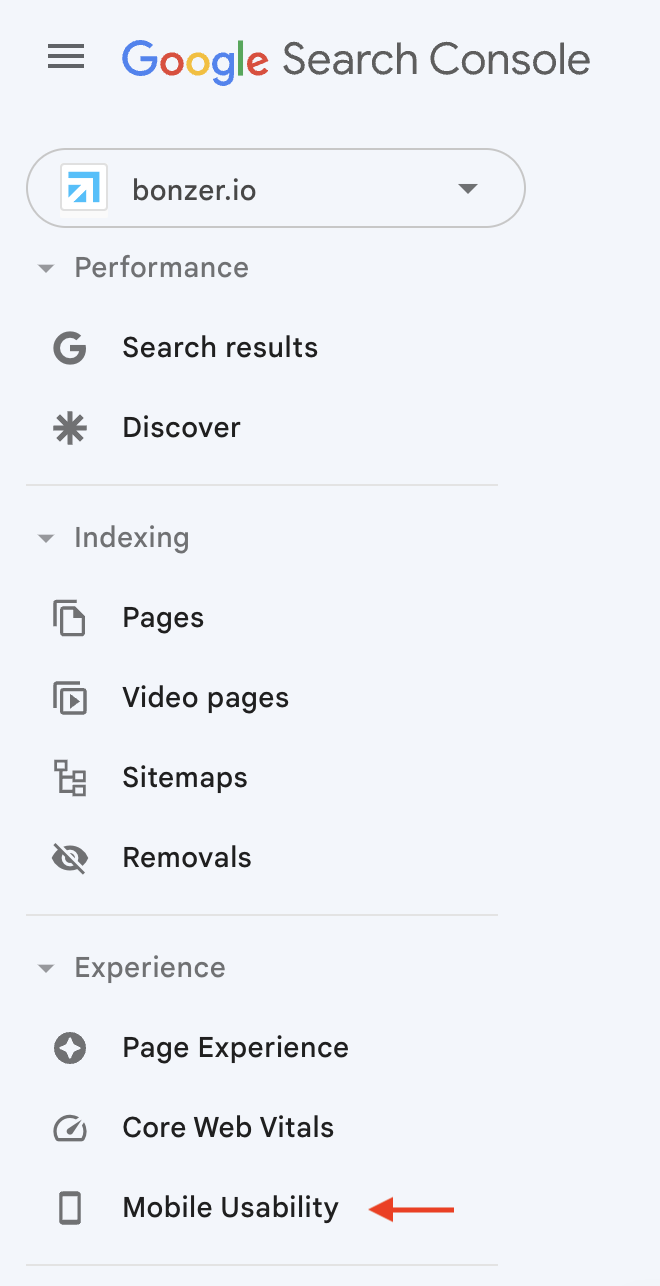
Google Search Console will let you know if there are any issues with your page. These could be too small content or any other layout issues.
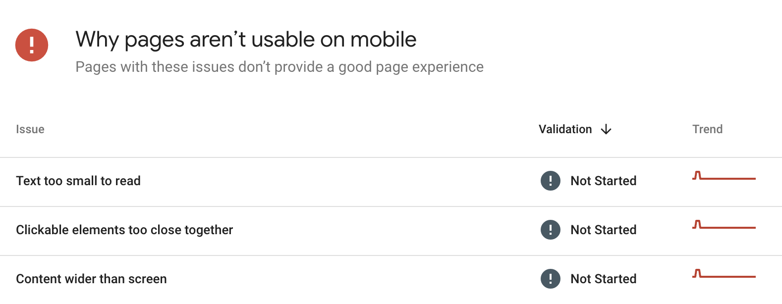
These insights can be used to make necessary changes to the website.
Lastly, you can use Google Analytics 4 to get various insights on the device category, browser or operating system, user use to visit your website. In order to access this information, simply click on Reports > Tech > Overview.
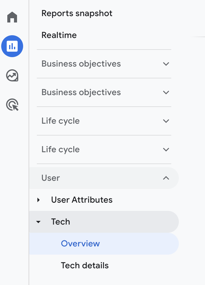
This will provide you with a holistic overview of your page. For more detailed insights on specific landing pages, review the report under Life Cycle> Engagement > Landing Page. Understand how mobile visitors interact with your site and adjust your strategy accordingly.
Find more insights on how to use the new GA4 in our blog.
Future of Mobile SEO and the Role of Voice Search
Experts believe that the future of mobile SEO is closely related to the rise of voice search. As an increasing number of users are using voice assistants like Siri and Google Assistant, optimizing for voice search-friendly keywords becomes vital.
Voice search queries tend to be more conversational, so one should aim to target long-tail, natural-language keywords.
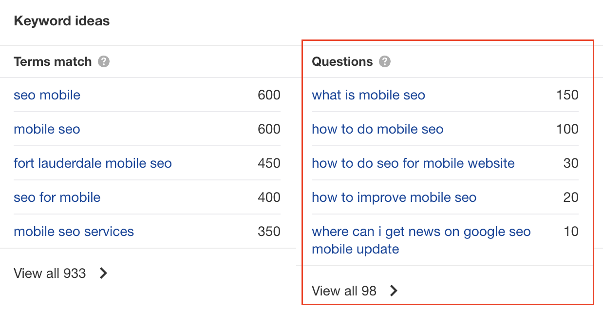
Here a keyword research tool such as Ahrefs can be helpful. When doing keyword research, consider investigating the “Questions” section more in-depth. This can provide valuable insights into relevant keywords.
Final remarks on mobile SEO
Investing in mobile SEO is a strategic move that can significantly impact your business's revenue and conversion rates. By prioritizing page speed, mobile-friendly content, responsive design, structured data, and voice search optimization, you'll be well-equipped to succeed in the mobile-centric digital landscape.
Stay ahead of the curve by continuously adapting to emerging mobile SEO trends and providing exceptional user experiences on all devices.

Let us show you an SEO strategy that can take you to the next level
A brief meeting, where we review your position in the market and present the opportunities.
Let us show you an SEO strategy that can take you to the next level
A brief meeting, where we review your position in the market and present the opportunities.